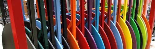
Color in doses, in Martinique
Color is love, isn’t it? We use it to create a mood, to be welcoming, to refer to an era we love, to express joy and comfort. My husband Kevin and I were just in the West Indies (You’ll be hearing about that through several more blogs!) so of course we have been enjoying color for ten days. But because we were in Martinique, which is really France – vraiment — the use of color there was subtle, gorgeous, true to nature, and that much more arresting.
Everywhere we went, the predominant materials in the interiors were natural: Wood, dried palms and banana leaves, stone. The “island of flowers” appeared mostly green, with bursts of cardinal red in a spiky tropical bloom, the flash of metallic blue-bottle green on the wings of an almost black hummingbird, a glimpse of the yellow breast of the tiny Bananaquit, or Sucrier, a busy, buzzing bird in the trees overhead.


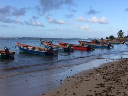
The use of color in our hotels, in restaurants, and outside was the same. Colorful houses were washed in pale pastels. Wooden boats painted in jewel-toned stripes floated in the dark blue waters of the harbors. A simple café might have tables dressed in oilcloths with flowers or the native madras plaid pattern in yellow, orange, and green.
The effect was elegant, celebratory, and gentle – leaving plenty of room to absorb the natural beauty all around.


